


Author: Dune
Compiled by: Ken, Chaincatcher
Everyone is citing supply data. It appears in every report, every earnings call, every policy hearing. But beyond “circulating supply exceeding $300 billion,” how much do we really know about stablecoins?
Who holds them? How concentrated is ownership? How fast do they move, and on which chains? What are their actual uses—DeFi liquidity, payments, or simply holding?
@Meta has just announced plans to integrate third-party stablecoin payments across all its platforms; @Stablecoin has received approval from the U.S. Office of the Comptroller of the Currency (OCC) for a national trust bank charter. @Payoneer has announced stablecoin payment capabilities for 2 million businesses. @Anchorage has launched compliant stablecoin services for non-U.S. banks. Institutions and regulators are accelerating their entry—they need answers far beyond just a supply figure.
We used Dune’s newly launched stablecoin dataset—developed in collaboration with @SteakhouseFi—to answer some of these questions. Here’s what the data reveals.
Supply landscape
Among the top 15 stablecoins on EVM, Solana, and Tron, the fully diluted supply reached $304 billion as of January 2026, a 49% year-over-year increase. @tether’s USDT ($197 billion) and @circle’s USDC ($73 billion) continue to dominate 89% of the market share. By chain, @ethereum hosts $176 billion (58%), Tron $84 billion (28%), @solana $15 billion (5%), and @BNBCHAIN $13 billion (4%). Despite the total supply nearly doubling, this blockchain distribution格局 has remained nearly unchanged over the past year.
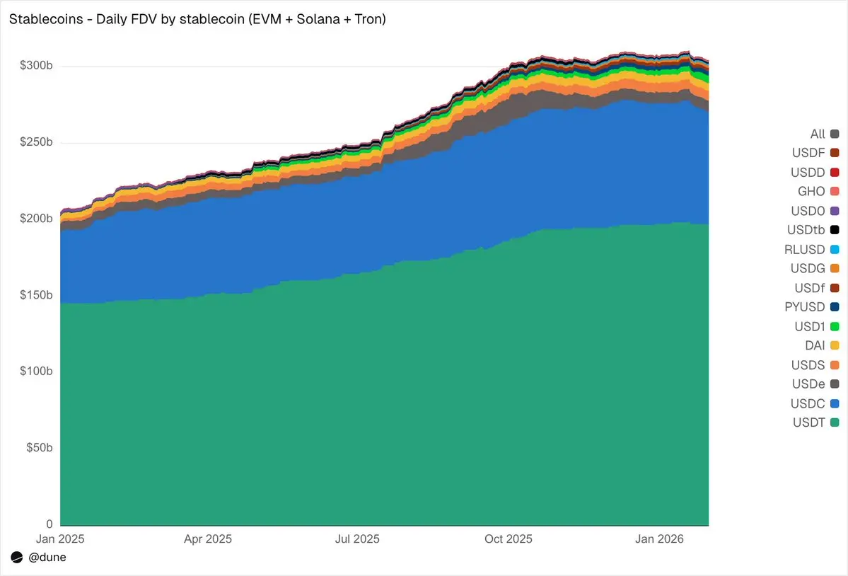
Beneath the top two stablecoins, 2025 was the year of the challengers. USDS (@SkyEcosystem/MakerDAO) grew 376% to $6.3 billion. PYUSD (@PayPal) surged 753% to $2.8 billion. RLUSD (@Ripple) jumped from $58 million to $1.1 billion, a remarkable 1,803% increase. USDG expanded 52-fold. USD1 skyrocketed from zero to $5.1 billion. Not all challengers moved in the same direction: USD0 declined 66%, while @ethena’s USDe, after tripling from its October peak, ended the year up 23%. Even so, the cohort of competitors beneath USDT and USDC has undergone a decisive expansion.
Who holds them?
Most stablecoin datasets can tell you the total supply. Because our dataset tracks balances at the wallet level using address labels, we can tell you exactly who holds them.
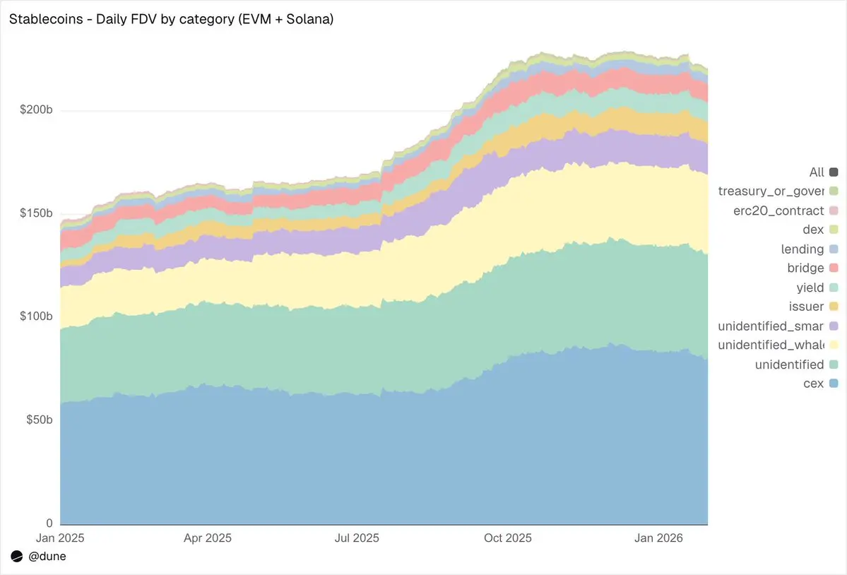
On EVM and Solana, centralized exchanges (CEXs) are the largest known category, with holdings reaching $80 billion, up from $58 billion a year ago. Stablecoins remain primarily infrastructure for exchange trading and settlement. Whale wallets hold $39 billion. Holdings in yield protocols have nearly doubled to $9.3 billion, reflecting growth in on-chain yield strategies. Issuer addresses—treasuries and mint/burn contracts—have surged 4.6-fold from $2.2 billion to $10.2 billion, directly indicating how much new supply has entered the market.
Regarding the quality of address labels: only 23% of the supply is held in completely unknown addresses. This is an exceptionally high identification rate for on-chain data, which is crucial for anyone seeking to understand where the actual risks of the stablecoin are concentrated.
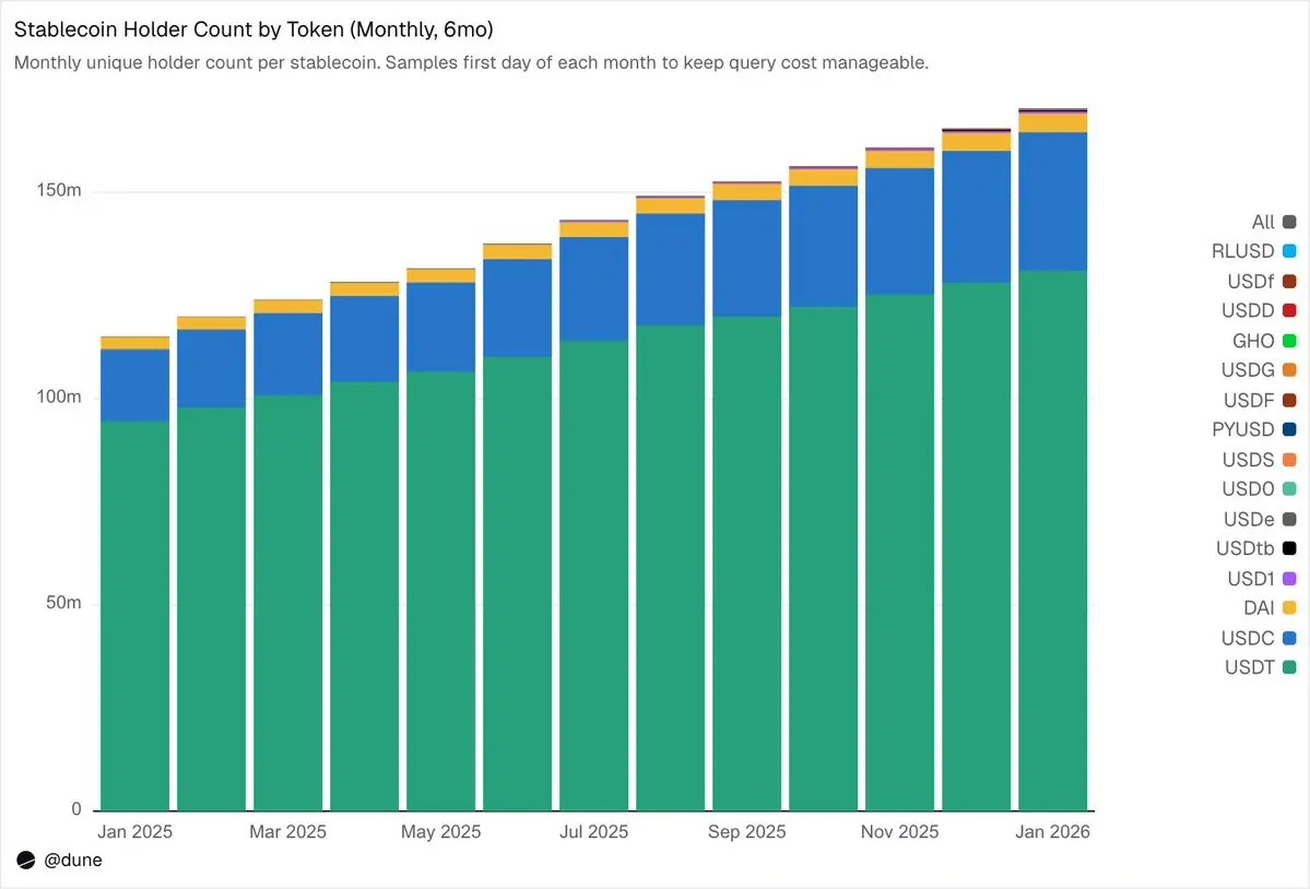
172 million holders, but with extremely high concentration
As of February 2026, 172 million unique addresses held at least one of these 15 stablecoins. Of these, USDT accounted for 136 million addresses, USDC for 36 million, and DAI for 4.7 million. These three stablecoins exhibit truly broad distribution: their top 10 wallets hold only 23–26% of the supply, and their HHI (Herfindahl-Hirschman Index, a standard economic measure of concentration, where 0 indicates perfect dispersion and 1.0 indicates a single holder) is below 0.03.
Each other stablecoin tells a very different story. The top 10 wallets hold 60–99% of the supply. Despite a circulating supply of $6.9 billion, 90% of USDS is concentrated in just 10 wallets (HHI 0.48). The top 10 wallets hold 99% of USDF (HHI 0.54). USD0 is even more extreme: the top 10 wallets hold 99%, with an HHI as high as 0.84, indicating that the supply is nearly monopolized by one or two of these largest holders.
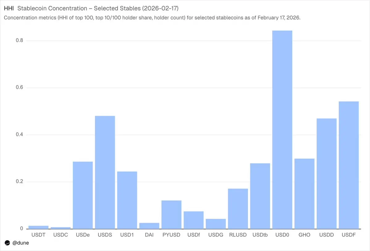
This does not mean there is anything inherently wrong with these stablecoins—some are newly launched, while others are intentionally created by institutional investors. But it does mean that their supply data should be interpreted in a fundamentally different way than that of USDT or USDC. Concentration drives depegging risk, liquidity depth, and determines whether supply figures reflect genuine demand or the actions of just a few large participants. This level of analysis is only possible when you have access to the balance of each holder, not just the total supply derived from minting/burning events.
$10.3 trillion in funds transferred in January
In January 2026, stablecoin transfer volumes on EVM, Solana, and @trondao reached $10.3 trillion, more than double the amount in January 2025. The chain-by-chain breakdown is striking and differs significantly from supply figures: Base led with $5.9 trillion in transfer volume, despite a supply of only $4.4 billion. Ethereum recorded $2.4 trillion, Tron $682 billion, Solana $544 billion, and BNB Chain $406 billion.
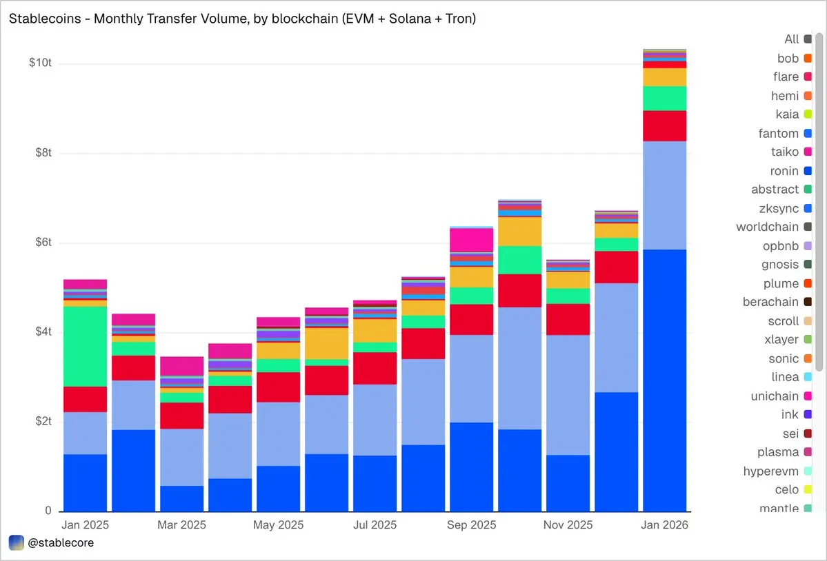
By token, USDC dominates with $8.3 trillion in transfer volume—nearly five times the $1.7 trillion of USDT—despite having 2.7 times less supply than USDT. USDC is transferred more frequently and at a faster rate than USDT. DAI’s transfer volume is $138 billion, USDS is $92 billion, and USD1 is $43 billion.
Importantly, this data is intentionally kept neutral. The dataset does not pre-filter transfers based on a fixed interpretation of “real” economic activity, so the total may include funds flows related to arbitrage, bots, internal routing, or other automated behaviors. Rather than hardcoding these subjective judgments, the dataset aims to present an objective view of on-chain activity and empower users to apply their own filters—whether to exclude bot-driven volume, isolate genuine organic usage, or define a customized metric for transfer activity.
What are the real-world uses of stablecoins?
This is precisely where the granularity of this dataset shines. Transfers are no longer merely labeled as simple “volume,” but are categorized into distinct on-chain activities. This is the difference between “knowing that $10 trillion was transferred” and “understanding why it was transferred.”
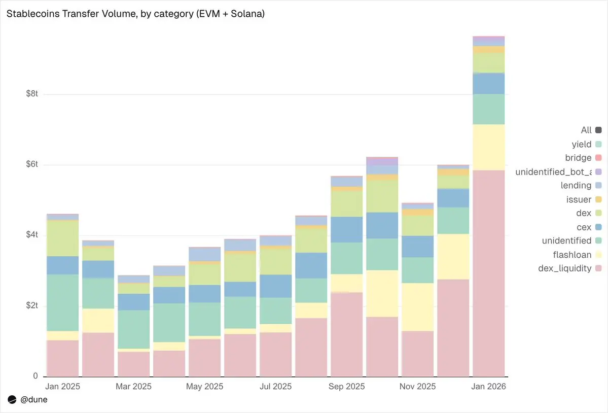
January data breakdown:
Market Infrastructure (DEX Trading and Liquidity)
Provide DEX liquidity and withdraw from liquidity pools:$5.9 trillion. This is the largest single use case, reflecting the role of stablecoins as foundational assets for on-chain market making.
DEX Swaps:$376 billion. Direct trading activity across automated market makers.
These two categories together highlight that stablecoins primarily serve as collateral and liquidity infrastructure for trading. Interestingly, trading volume is concentrated inincentive-driven activities (such as liquidity mining and active capital optimization), rather than pure trading demand.
Leverage and Capital Efficiency (Borrowing + Flash Loans)
Flash loans (borrow and repay):$1.3 trillion. Automated arbitrage and liquidation cycles.
Lending activities — lend, borrow, repay, withdraw:$137 billion. This layer represents on-chain short-term capital efficiency and structured credit.
Access Channels (CEX and Cross-Chain Bridges)
CEX Fund Flows— Deposits ($224B), Withdrawals ($224B), Internal Transfers ($151B): Total $599B.
Chain bridge deposits and withdrawals:$28 billion. These capital flows indicate that stablecoins are serving as a channel for transactions between centralized exchanges and cross-chain settlement.
Issuer Layer (Currency Operations)
Issuer Operations—Minting ($28B), Burning ($20B), Peg Rebalancing ($23B), and other issuer activities: totaling $106B. Nearly five times the record of $42B from almost a year ago.
Yield protocol
Yield Protocol Activity:$2.7 billion. This is a smaller but structurally significant segment closely tied to structured strategies and on-chain asset management.
Overall, 90% of transfer volume flows through identified activity categories, providing us with a granular view of how stablecoins move across every layer of the on-chain technology stack.
Velocity: The same token, different worlds
Daily velocity (transfer volume divided by supply) may be the most underutilized metric in stablecoin analysis. It tells us the ratio of how actively stablecoins are used as a medium of exchange versus simply being held.
Among the tokens we analyzed, USDC and USDT once again stood out, though they performed differently.
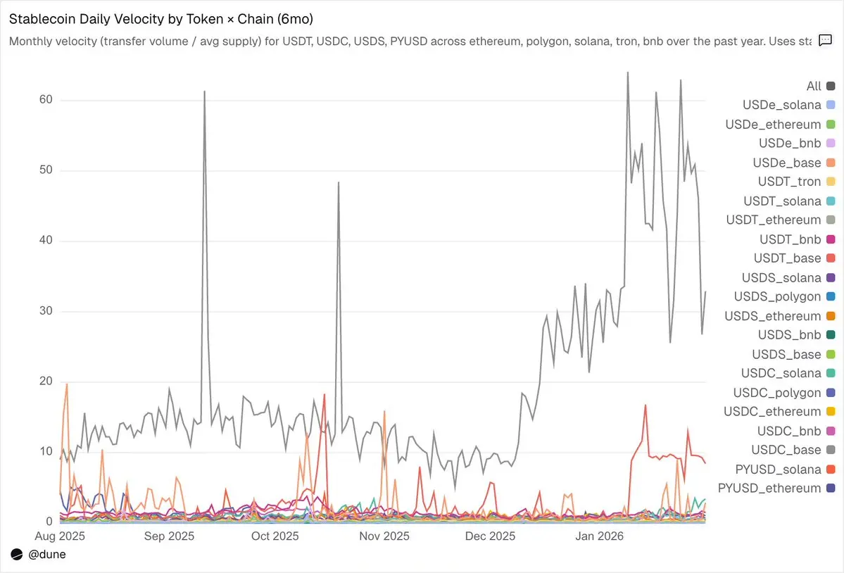
USDC circulates fastest on L2s and Solana.On Base, USDC’s daily median turnover reaches an impressive 14x, driven by high-frequency DeFi activity. On Solana and Polygon, its daily turnover remains steady at around 1x. Even on Ethereum, USDC achieves a turnover rate of 0.9x, meaning nearly its entire supply circulates daily.
USDT circulates fastest on the BNB and Tron networks, the two leading platforms for trading and payments.On the BNB chain, USDT’s daily turnover rate reaches 1.4x, reflecting active trading. On Tron, the turnover rate is lower at 0.3x, but remains exceptionally stable day after day, consistent with its role as a dominant cross-border payment channel. However, on Ethereum, USDT’s turnover rate is only 0.2x, with over $100 billion in supply largely idle.
USDe and USDS have slower velocity, which is by design.On Ethereum, the daily turnover rate for USDe is only 0.09x, while for USDS it is 0.5x. Both are designed as yield-bearing stablecoins: USDe is typically staked as sUSDe to capture earnings from Ethena’s delta-neutral funding rate strategy, while USDS is deposited into the Sky Savings Rate to earn protocol-provided yields. As a result, a significant portion of the supply remains in savings contracts, lending markets like Aave, or structured yield loops. Here, low velocity is not a flaw but a feature: these assets are engineered to accumulate yield, not to circulate.
The blockchain on which a token resides is more important than the token itself.PYUSD on Solana has a daily turnover rate of 0.6x, more than four times faster than its rate on Ethereum (0.1x). The same token, entirely different usage patterns—depending on which ecosystem it exists in.
Supply and transfer volume each tell only part of the story. Velocity connects them, capturing in a single metric whether a particular stablecoin on a given chain is functioning as active infrastructure or merely sitting as idle funds.
Beyond USD
This analysis primarily focuses on 15 USD-pegged stablecoins, but the full dataset extends far beyond this. It tracks over 200 stablecoins representing more than 20 fiat currencies: the Euro (17 tokens, $990 million supply), the Brazilian Real ($141 million), the Japanese Yen ($13 million), as well as tokens denominated in NGN (Nigerian Naira), KES (Kenyan Shilling), ZAR (South African Rand), TRY (Turkish Lira), IDR (Indonesian Rupiah), SGD (Singapore Dollar), and others.
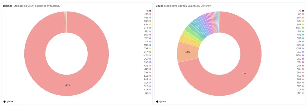
The total supply of non-U.S. dollar stablecoins currently stands at $1.2 billion, with 59 tokens live across six continents, accounting for nearly 30% of all tokens in our dataset. The infrastructure for local fiat stablecoins is now being built on-chain, and the data to track it is already available.
Just the tip of the iceberg
All content in this analysis is derived from just a few queries on a single dataset. We examined only 15 stablecoins and a few core metrics, but the full dataset covers nearly 200 stablecoins across more than 30 blockchains.
In addition to its broad coverage, what sets this dataset apart is its classification hierarchy. Each transaction is mapped to its on-chain trigger and categorized into one of nine activity classes using a deterministic priority framework. Each balance is segmented by holder type and follows a standardized classification system across all chains. Together, these features transform noisy blockchain logs into structured, comparable data—revealing mechanistic shifts, capital flows between venues, concentration risks, and participation patterns.
This level of granularity can answer questions we haven’t even asked yet: Which wallets began accumulating a new stablecoin before it launched on the exchange? How did holder concentration shift in the days leading up to a depeg event? What are the cross-chain funding flows for euro-denominated stablecoins? How does the issuer’s minting/burning pattern correlate with market pressure? And many more like these.
This is precisely the type of dataset designed to support institutional-grade analysis, research publication, risk modeling frameworks, compliance monitoring workflows, and executive dashboards. Depth is here. Start digging.