
Bitcoin Rainbow Chart Review 2026: Pricing, Plans, & Model Features
2026/03/23 17:30:02
The Bitcoin Rainbow Chart has long been the North Star for long-term crypto investors seeking to navigate the volatile waves of market cycles. As we move through 2026, this logarithmic regression model remains a vital tool for distinguishing between genuine growth and speculative bubbles, helping participants on platforms like KuCoin and Halo Wallet make data-driven decisions.
This comprehensive 2026 review explores the latest updates to the rainbow bands, its integration with modern DeFi wallets, and how it compares to other valuation models.
Key Takeaways:
-
The Bitcoin Rainbow Chart is a long-term valuation tool based on a logarithmic regression curve.
-
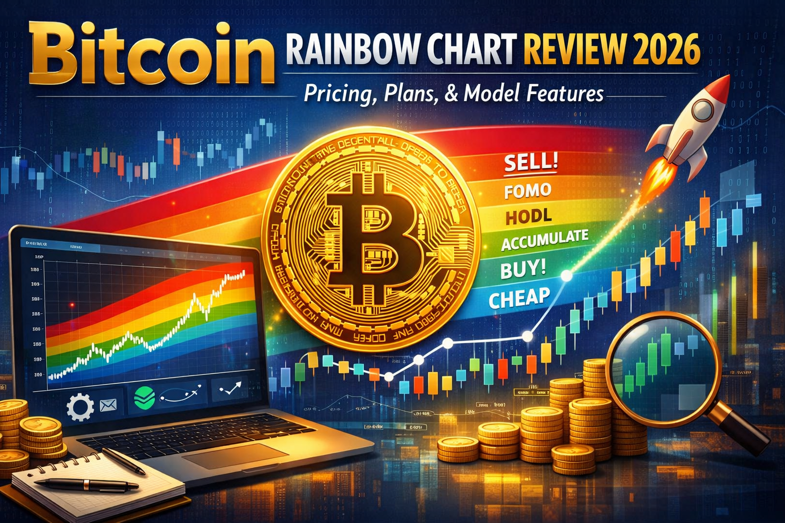
In 2026, the model features nine distinct color bands ranging from "Fire Sale" (Blue) to "Maximum Bubble Territory" (Dark Red).
-
The chart is primarily a sentiment-based indicator, not a financial crystal ball, and works best when paired with on-chain data.
-
Newer versions now include specialized charts for assets like Ethereum (ETH) and Solana (SOL).
-
Integration with cold storage and Web3 wallets like Halo Wallet is the gold standard for securing long-term portfolio gains.
Our Take on Bitcoin Rainbow Chart
At its core, the Bitcoin Rainbow Chart is the ultimate "sanity check" for the crypto industry. While day traders obsess over 15-minute candles, the Rainbow Chart forces you to zoom out and look at the macro trajectory of the world's leading digital asset. Our analysis suggests that in the "ETF Era" of 2026, the chart has evolved from a simple meme into a respected framework for institutional and retail accumulation alike.
It successfully visualizes the law of diminishing returns—the idea that as Bitcoin matures, its price peaks become less extreme, fitting perfectly within the flattening curves of the upper rainbow bands. For anyone serious about surviving multiple halving cycles, this tool is an essential piece of the analytical puzzle.
Bitcoin Rainbow Chart Overview
The Bitcoin Rainbow Chart provides a visual overlay of Bitcoin’s price history against a mathematical trendline. By using a logarithmic scale, it accounts for the fact that a move from $10 to $100 is just as significant in percentage terms as a move from $10,000 to $100,000.
Core Statistics for 2026
| Feature | Description |
| Model Type | Logarithmic Regression |
| Primary Asset | Bitcoin (BTC) |
| Secondary Assets | ETH, SOL |
| Update Frequency | Real-time (Daily) |
| Primary Indicators | Price, Halving Dates, Sentiment Bands |
What Is Bitcoin Rainbow Chart?
The Bitcoin Rainbow Chart is a non-linear regression model that tracks the price of Bitcoin over time, adjusted for its exponential growth. In the 2026 edition, the model has been refined to account for the massive influx of institutional capital via Spot Bitcoin ETFs, which has historically dampened the "wild west" volatility seen in earlier cycles.
The Evolution of the Model
Originally created by Bitcointalk user Trolololo in 2014 and later colorized by Azure, the chart has survived several "deaths." Most notably, after the FTX collapse in late 2022, Bitcoin briefly fell below the "Fire Sale" band. This led to the creation of the Rainbow Chart V2, which adjusted the regression formula to better fit the maturing market dynamics we see today.
How Does Bitcoin Rainbow Chart Work?
Standard price charts use a linear scale, where the distance between $1 and $2 is the same as the distance between $100,000 and $100,001. This is useless for Bitcoin. The Rainbow Chart uses logarithmic regression, which focuses on percentage growth.
The Math Behind the Rainbow
The model applies a specific formula to historical data:
y= a+b*ln(x)
Where:
-
y represents the price of Bitcoin.
-
x represents the time (usually in weeks since the Genesis Block).
-
a and $b$ are constants derived from fitting the curve to historical highs and lows.
Why Logarithmic?
-
Captures Growth: It reflects how Bitcoin's growth rate naturally slows down as its market capitalization reaches into the trillions.
-
Noise Reduction: It ignores daily volatility "noise" to focus on the multi-year signal.
-
Standard Deviation: The colored bands are essentially standard deviation layers above and below the central regression line.
Bitcoin Rainbow Chart Key Features: The Nine Color Bands
The magic of the chart lies in its intuitive color-coded zones. Each band represents a different psychological state of the market.
The Warm Bands (Selling/Caution)
-
Dark Red (Maximum Bubble Territory): Historically, this is where the cycle peaks. Extreme euphoria.
-
Red (Sell. Seriously, SELL!): Momentum is unsustainable. Time to take significant profits.
-
Dark Orange (FOMO Intensifies): Retail interest is peaking. Social media is flooded with "to the moon" posts.
-
Light Orange (Is This a Bubble?): The price is well above fair value, but the trend is still strong.
The Neutral Band
-
Yellow (HODL!): This is the center of the rainbow. The price is at its "fair value" based on the regression model. It is neither a strong buy nor a strong sell.
The Cool Bands (Buying/Accumulating)
-
Light Green (Still Cheap): A great time for those who missed the bottom to enter the market.
-
Green (Accumulate): Highly favorable risk/reward ratio for long-term holders.
-
Light Blue (BUY!): Significant undervaluation. Historically, these zones don't last long.
-
Dark Blue (Basically a Fire Sale): Total capitulation. "Bitcoin is dead" headlines are everywhere. This is the ultimate entry point.
Is Bitcoin Rainbow Chart Free to Use?
Yes, the Bitcoin Rainbow Chart remains a free, open-source tool for the crypto community. Unlike proprietary institutional terminals that charge thousands in subscription fees, the Rainbow Chart is maintained by community-driven sites like BlockchainCenter and various analytical dashboards.
Bitcoin Rainbow Chart Pricing and Data Sources
Since the chart itself is an analytical model rather than a product, there is no "pricing plan" in the traditional sense. However, the data sources that power the chart are critical for its accuracy.
Where Does the Data Come From?
-
CoinGecko & CoinMarketCap APIs: Most versions of the chart pull real-time price data from these aggregators to ensure the "live" price dot is accurate.
-
Exchange Feeds: High-fidelity versions of the chart use direct feeds from major exchanges like KuCoin, Binance, and Coinbase to calculate the weighted average price.
-
Historical Archives: For data dating back to 2009, the model uses historical datasets from the (now defunct) Mt. Gox and early Bitstamp records.
What Market Phases Are Supported by Bitcoin Rainbow Chart?
The Rainbow Chart is designed to identify the four primary phases of a market cycle:
-
Accumulation Phase: Represented by the Blue and Green bands. Smart money buys here while the general public is fearful.
-
Markup Phase: The transition from Green to Yellow and then Orange. This is the "meat" of the bull market.
-
Distribution Phase: Represented by the Red and Dark Red bands. This is where whales sell their bags to late-coming retail investors.
-
Markdown Phase (Bear Market): The price crashes back down through the bands, eventually landing back in the Blue/Green zones to start the cycle anew.
What Exchanges Are Integrated with Rainbow Chart Data?
In 2026, leading crypto exchanges have begun integrating "Cycle Indicators" directly into their trading interfaces.
Supported Platforms
-
KuCoin: Known for its "People's Exchange" status, KuCoin offers advanced charting tools where users can overlay logarithmic regression bands similar to the Rainbow model.
-
Halo Wallet (formerly KuCoin Wallet): This Web3 wallet allows users to view their portfolio value against Rainbow Chart zones, helping them decide if it's time to swap to stables.
-
Bitget: Offers "Smart DCA" bots that increase buying frequency when the price is in the blue "Fire Sale" band.
-
OKX: Provides "Market Sentiment" dashboards that utilize Rainbow-style regression to help users avoid buying at local tops.
Recommendation: Combining Rainbow Chart with KuCoin Wallet (Halo Wallet)
For the modern investor, simply looking at a chart isn't enough; you need to act on the data. We highly recommend using Halo Wallet (integrated with the KuCoin ecosystem) to manage your Rainbow strategy.
Why This Combination Works
-
Real-Time Analytics: Halo Wallet provides a "Social Fi" aspect where you can see what top "Rainbow Strategists" are doing with their portfolios.
-
Instant Swaps: If the Bitcoin Rainbow Chart hits the "Red" zone, you can instantly swap your BTC for USDT or USDC within Halo Wallet to lock in gains.
-
Security: By keeping your assets in a non-custodial wallet like Halo, you retain control while using the Rainbow Chart as your tactical map.
What Assets Beyond BTC Are Supported by Rainbow Models? (ETH & SOL Rainbows)
The success of the BTC model has led to the creation of Ethereum Rainbow Charts and, more recently, Solana Rainbow Charts.
Ethereum Rainbow Chart
The ETH version uses a similar logarithmic regression but accounts for Ethereum's "triple halving" (the reduction in supply through EIP-1559 and Proof of Stake). In 2026, the ETH Rainbow is a staple for DeFi participants.
Solana Rainbow Chart
Because Solana is a younger asset with higher volatility, its rainbow bands are wider. It is particularly useful for identifying the "Overextended" phases during SOL's massive ecosystem expansions.
How To Read the Current 2026 Price Bands
Reading the chart in 2026 requires an understanding of the current price ranges. As of March 2026, Bitcoin's price bands have shifted upward.
Current 2026 Estimates (Hypothetical)
-
Maximum Bubble Territory: $450,000+
-
HODL (Yellow): $120,000 - $150,000
-
Accumulate (Green): $85,000 - $100,000
-
Fire Sale (Blue): Under $70,000
Note: These values are based on the logarithmic growth curve and change daily.
How To Secure Your Long-Term Portfolio Using Rainbow Signals
Using the Bitcoin Rainbow Chart is about risk management. A common strategy used by pro investors in 2026 is the "Band-Based Allocation" method:
-
In Blue/Green: Allocate 80% of your capital to BTC and 20% to stables.
-
In Yellow: Maintain a 50/50 split.
-
In Orange/Red: Shift to 20% BTC and 80% stables.
This systematic approach removes the emotional urge to "buy high and sell low."
How To Add Your Cold Storage (Ledger/Trezor) to Your Rainbow Strategy
Long-term "Rainbow" investors should never keep their entire stack on an exchange. To truly secure your portfolio:
-
Step 1: Connect your Ledger or Trezor to a compatible interface like Halo Wallet.
-
Step 2: Use the Rainbow Chart to identify "Fire Sale" zones.
-
Step 3: Purchase BTC on a reliable exchange like KuCoin.
-
Step 4: Immediately withdraw the BTC to your cold storage address.
-
Step 5: Only move funds back to the exchange when the Rainbow hits the Red or Dark Red zones.
Bitcoin Rainbow Chart Security Features & Model Integrity
The "security" of the Rainbow Chart isn't about encryption—it's about model integrity.
How the Model Stays Relevant
-
V2 Adjustments: The 2022 update proved the model can adapt. By lowering the lower bounds, it remained mathematically sound even during extreme black swan events.
-
Transparency: Because the formula is public, anyone can audit the math. This prevents "manipulation" of the bands to suit a specific narrative.
-
Decentralized Hosting: The chart is hosted on multiple independent websites, ensuring that no single entity can "shut down" the tool.
Bitcoin Rainbow Chart Compared To S2F (Stock-to-Flow) & MVRV Z-Score
To be a successful SEO-driven investor, you must understand how the Rainbow Chart stacks up against its rivals.
Comparison Table
| Model | Focus | Primary Metric | Best Use Case |
| Rainbow Chart | Sentiment | Logarithmic Regression | Macro Cycle Timing |
| Stock-to-Flow (S2F) | Scarcity | Supply/Halvings | Long-term Price Floors |
| MVRV Z-Score | On-chain Value | Market Cap vs. Realized Cap | Identifying Market Bottoms |
While S2F focuses on supply and MVRV focuses on on-chain data, the Bitcoin Rainbow Chart focuses on the behavioral price trend. Most experts recommend using the Rainbow Chart as your primary visual guide and MVRV as a secondary confirmation.
Final Thoughts On Bitcoin Rainbow Chart in the ETF Era
In conclusion, the Bitcoin Rainbow Chart remains one of the most resilient and intuitive tools for navigating the cryptocurrency markets in 2026. By distilling complex logarithmic regression into a simple, color-coded spectrum, it democratizes market analysis for everyone—from first-time buyers to seasoned whales. While it is not a perfect predictor and should never be used in isolation, its historical track record of identifying cycle extremes is undeniable. As Bitcoin continues to integrate with global finance via ETFs and institutional adoption, the Rainbow Chart serves as a vital reminder of the asset's fundamental growth trajectory.
FAQs
-
Is the Bitcoin Rainbow Chart accurate for 2026?
The Bitcoin Rainbow Chart is a historical regression model, not a future-telling device. While it has accurately mapped every major cycle since 2009, it is designed to show probabilities rather than certainties. It remains highly accurate for identifying general overvaluation and undervaluation zones in 2026.
-
What does the "Fire Sale" band mean?
The Dark Blue "Fire Sale" band indicates that Bitcoin is extremely undervalued relative to its historical growth. Historically, when the price enters this band, it represents a generational buying opportunity, often occurring during periods of maximum market fear.
-
Can I use the Rainbow Chart for short-term trading?
No, the Bitcoin Rainbow Chart is a macro-level tool. It is not designed for day trading or scalping. It is best used by long-term investors looking to time their entry and exit points over months or years.
-
Why did the Rainbow Chart change in 2022?
The model was updated to "V2" because Bitcoin's price briefly fell below the original "Fire Sale" band during the 2022 bear market. The developers adjusted the curve to better reflect the diminishing volatility of a maturing asset class.
-
Does the Rainbow Chart take the Bitcoin Halving into account?
Yes, most versions of the Bitcoin Rainbow Chart include vertical markers for the 4-year halving events. These halvings are the fundamental drivers of the supply-demand shifts that cause Bitcoin to move through the different color bands of the rainbow.