


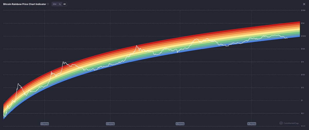
🔥 The system trained you to chase price… but the real signal is where you sit in the cycle This chart maps $BTC across colored bands over time, showing how price moves between undervalued zones and overheated extremes. Each halving resets the structure, and history shows price repeatedly climbing through these ranges, not randomly but in phases That matters because timing improves when you understand positioning, not emotions. You stop reacting to spikes and start recognizing where risk and opportunity actually shift Inside the Academy, we teach how to read these cycles so you act with context, not impulse Positioning beats guessing every time 🎯

Share


Source:Show original
Disclaimer: The information on this page may have been obtained from third parties and does not necessarily reflect the views or opinions of KuCoin. This content is provided for general informational purposes only, without any representation or warranty of any kind, nor shall it be construed as financial or investment advice. KuCoin shall not be liable for any errors or omissions, or for any outcomes resulting from the use of this information.
Investments in digital assets can be risky. Please carefully evaluate the risks of a product and your risk tolerance based on your own financial circumstances. For more information, please refer to our Terms of Use and Risk Disclosure.