
Top 10 BTC ETFs: Fund Flows, Holdings, Average Cost & Profit/Loss Analysis
2026/03/30 17:27:02

Bitcoin is no longer viewed solely as a speculative asset. As the cryptocurrency market has matured, spot Bitcoin ETFs have become a clear indicator of growing institutional and mainstream participation. These ETFs make Bitcoin easier to access through regulated channels, and their fund flow data has become a key tool for tracking market momentum and investor interest.
However, inflows alone do not tell the full story. To truly understand which BTC ETFs are strongest, it’s important to also consider holdings, implied average cost, and unrealized profit or loss.
This article examines the top 10 BTC ETFs through this broader lens. By the end, readers will understand what ETF fund flows reveal, how the funds differ in positioning, and what these patterns may suggest for the wider cryptocurrency market.
Hook
What do Bitcoin ETF inflows actually tell investors: real strength, short-term momentum, or something much more revealing beneath the surface?
Overview
-
This article compares the top 10 BTC ETFs using more than just headline inflow numbers.
-
It looks at fund flows, BTC holdings, implied average cost, and unrealized profit/loss together.
-
It explains how these metrics help reveal market momentum, investor demand, and fund positioning.
-
It highlights the difference between commercial success, scale, and actual position strength.
-
It also shows what these ETF trends may suggest about the broader cryptocurrency market and institutional participation.
Thesis
This article examines the top 10 BTC ETFs by looking beyond headline fund flows and comparing the deeper metrics that shape fund strength and investor positioning. The goal is to show how these ETFs differ in scale, cost efficiency, and current profit/loss profile so readers can better understand what the numbers actually mean.
What BTC ETF Fund Flows Really Tell Us About Bitcoin ETF Demand
BTC ETF fund flows show the net amount of money moving into or out of a fund. Positive flows mean fresh capital is coming in, while negative flows mean investors are redeeming shares. That part is simple. What matters more is how those flows are read.
A strong single-day inflow can make headlines, but cumulative flows usually tell a more important story. They show whether a fund has been attracting consistent demand over time, which is a better sign of sustained investor interest than a one-off spike.
That is why BTC ETF flows matter so much. Spot Bitcoin ETFs gave a much wider group of investors easier access to Bitcoin through a familiar, regulated structure. Instead of relying only on on-chain data or exchange activity, analysts now have a clear way to track institutional and mainstream demand.
Still, flows alone do not tell you how strong a fund’s position really is. Two ETFs can post similar cumulative inflows but end up in very different positions depending on when that money entered the market. One may have built exposure at lower Bitcoin prices and now sit on gains. Another may have accumulated at higher prices and look much weaker during a pullback.
That is why a proper ETF comparison should include more than flows alone:
-
Fund flows show how much money has entered or left the ETF.
-
BTC holdings show how much Bitcoin the fund actually owns.
-
Current holdings value shows what that position is worth today.
-
Implied average cost helps estimate the average price paid for those holdings.
-
Unrealized profit or loss gives a rough sense of whether the fund is currently ahead or behind.
Looking at these metrics together gives a much clearer picture. Flows show investor demand, while holdings, cost basis, and profit/loss show how effectively that demand has been converted into a Bitcoin position.
The main exception is GBTC. Because it started as a trust before converting into a spot ETF, it entered the ETF market with a large pre-existing Bitcoin base. It has seen heavy outflows since conversion, but it still holds a substantial amount of Bitcoin. That makes a simple flow-based average cost or profit/loss calculation much less reliable for GBTC than for newer spot Bitcoin ETFs.
How BTC ETF Fund Flows Affect the Cryptocurrency Market
BTC ETF flows matter far beyond the funds themselves because spot ETFs have become one of the clearest public signals of institutional Bitcoin demand. When inflows rise, funds usually need to buy more Bitcoin, which can support bullish sentiment and reduce available supply in the market. When outflows increase, the signal can shift the other way, even if the immediate effect is more about sentiment than direct price pressure.
That is why ETF flow data is now followed so closely alongside price action, macro trends, and derivatives activity. It helps explain not just what Bitcoin is doing, but how investors are positioning around it.
A few key ways ETF flows affect the broader market:
-
They signal institutional demand. Strong inflows often suggest growing confidence from larger, more traditional investors.
-
They can shape market sentiment. Persistent inflows tend to support bullish narratives, while outflows can weaken confidence.
-
They influence competition among issuers. Not all ETFs attract capital equally, and the gap between leaders and smaller funds can become significant.
-
They reinforce Bitcoin’s mainstream status. Continued ETF demand strengthens the view of Bitcoin as a portfolio allocation tool, not just a speculative crypto asset.
Recent ETF activity also showed that strong trading volume does not always mean strong net inflows. In some cases, heavy volume reflects repositioning, hedging, or short-term trading rather than fresh demand. That distinction matters because flow data is often a better measure of conviction than turnover alone.
Flows also reveal how concentrated the market has become. BlackRock’s IBIT and Fidelity’s FBTC have captured a large share of the category’s success, while smaller funds compete for a much smaller slice of investor attention. That suggests scale, brand trust, and distribution now play a major role in the Bitcoin ETF market.
Why Holdings, Average Cost, and Profit/Loss Matter as Much as Flows
Understanding Bitcoin ETF performance requires more than looking at fund flows. While flows show where money is going, they don’t show what that money actually built. This is where holdings, average cost, and profit/loss become essential.
-
Holdings: The Real Bitcoin Exposure
-
Shows how much Bitcoin the ETF actually owns.
-
A fund with strong holdings growth has converted investor demand into real market exposure.
-
Scale affects both market influence and investor perception.
-
Example: IBIT holds the most Bitcoin, followed by FBTC and GBTC.
-
Average Cost: Measuring Efficiency
-
Calculated as cumulative inflows ÷ BTC held, giving an implied average purchase price per coin.
-
Lower average cost → more unrealized gains, better cushion against declines.
-
Higher average cost → greater exposure during drawdowns.
-
Explains why two ETFs with similar inflows may have very different risk profiles.
-
Profit/Loss: Current Position Strength
-
Shows whether a fund’s current holdings are ahead or behind cumulative inflows.
-
Current value > inflows → strong embedded gains.
-
Current value < inflows → position built at less favorable prices.
-
Especially important in volatile market conditions.
-
Why This Matters
-
Flows alone tell you which ETF attracted money.
-
Holdings, average cost, and profit/loss tell you how effectively that money was converted into Bitcoin positions.
-
Many reports stop at inflows and AUM, but smart investors need a deeper view of position quality.
Top 10 BTC ETFs: Fund Flows, Holdings, Average Cost, and Profit/Loss
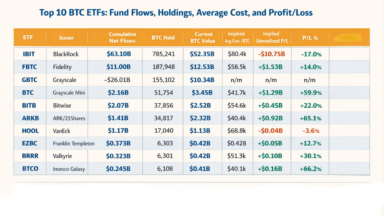
The table below compares the top 10 U.S. spot Bitcoin ETFs using two main data points: current holdings value from Bitbo’s U.S. ETF tracker and cumulative net flows from Farside Investors. Together, these figures give a much clearer view of how each fund is positioned, not just how much money it has attracted.
A Closer Look at the Top 10 BTC ETFs
IBIT: The Category Leader by Scale
BlackRock’s IBIT remains the clear leader in the U.S. spot Bitcoin ETF market. It ranks first in cumulative net inflows and first in BTC held, with no close rival in terms of size. From a market-share standpoint, it is the biggest success story in the category.
That dominance comes with one important caveat. Using the flow-to-holdings method, IBIT’s implied average cost is around $80.4k per BTC, which leaves it roughly $10.75 billion underwater on this snapshot. That does not mean the fund is weak or poorly run. It simply shows that a large share of demand came in at price levels that now look less favorable.
IBIT is the largest ETF by holdings and inflows because of its scale, visibility, and adoption. But when viewed through implied cost basis, it does not look as comfortable as the headline inflow numbers suggest.
FBTC: The Stronger Large-Scale Balance
Fidelity’s FBTC offers a very different profile. It is much smaller than IBIT, but it looks more balanced on this framework. With 187,948 BTC, a current value of about $12.53 billion, and cumulative net inflows near $11.0 billion, its implied average cost works out to roughly $58.5k per BTC.
That leaves FBTC with an unrealized gain of around $1.53 billion, which makes it one of the healthiest large funds in the group. For investors comparing major ETFs, FBTC stands out as a strong mix of scale, credibility, and healthier positioning.
GBTC: Still Large, but Different From the Rest
GBTC still holds 155,102 BTC worth about $10.34 billion, even after cumulative net outflows of roughly $26.01 billion. That keeps it firmly relevant by size, even though it no longer leads the field.
The reason GBTC needs to be treated differently is its structure. It began as a trust before converting into a spot ETF, so it entered the market with a large pre-existing Bitcoin base. Because of that, its outflows tell an important story about market-share loss, but they do not create a clean average cost or profit/loss comparison like the newer ETFs.
Grayscale Mini BTC: Smaller, but Well Positioned
Grayscale Mini BTC is one of the more interesting names in the group. It has around $2.16 billion in cumulative inflows, 51,754 BTC in holdings, and a current value near $3.45 billion. That gives it an implied average cost of about $41.7k and an unrealized gain of roughly $1.29 billion.
What stands out here is how efficient the positioning looks. The fund is much smaller than IBIT or FBTC, but on this snapshot it appears to have built its Bitcoin exposure at much more favorable levels.
BITB: A Solid Mid-Tier Fund
Bitwise’s BITB looks steady rather than flashy, which is not a bad thing. It has just over $2.07 billion in cumulative inflows, holds 37,856 BTC, and has a current value of around $2.52 billion. Its implied average cost is about $54.6k, leaving it with a positive unrealized gain of about $450 million.
BITB may not have the strongest upside profile in the table, but it looks healthy overall and does not carry the same heavier implied cost burden seen in some larger funds.
ARKB: One of the Strongest on Positioning
ARKB is one of the strongest mid-tier ETFs in this comparison. With $1.41 billion in cumulative inflows, 34,817 BTC in holdings, and a current value near $2.32 billion, its implied average cost comes out to about $40.4k.
That leaves ARKB with an unrealized gain of around $920 million, making it one of the best-looking ETFs in percentage terms. It may not match the leaders in size, but it stands out for how efficiently it appears to have built its position.
The Smaller Funds: Less Scale, Better Efficiency in Some Cases
The smaller end of the top 10 shows why size alone does not tell the full story. EZBC, BRRR, and BTCO all hold a little over 6,000 BTC each and have current values around $0.4 billion. By scale, they are far behind the leaders. By implied profitability, though, some look surprisingly strong.
BTCO stands out most. With about $245 million in cumulative inflows and 6,108 BTC worth roughly $410 million, it has an implied average cost near $40.1k and an unrealized gain of about $160 million. That gives it the strongest profit/loss percentage in the top 10.
BRRR also looks healthy, with an implied average cost near $51.3k and a positive unrealized gain of about $100 million. EZBC is profitable as well, though less dramatically. HODL is the exception among the smaller funds, with a higher implied average cost of about $68.8k, which leaves it slightly underwater at current values.
Challenges and Considerations
The Numbers Are Estimates, Not Exact Accounting
The biggest limitation is methodology. Average cost and unrealized profit/loss here are implied estimates, not official issuer disclosures based on exact tax lots or purchase timing. They are useful for comparison, but they simplify a much more complex reality.
Fund Structures Are Not Always Comparable
Not all Bitcoin ETFs can be evaluated in exactly the same way. GBTC is the clearest example because of its trust-to-ETF conversion, but even other funds can show timing differences between flows, creations, holdings updates, and valuation marks. That makes this framework more useful as a directional tool than a precise accounting model.
Bitcoin’s Volatility Can Change the Picture Fast
Bitcoin moves quickly, and that can change ETF comparisons in a short period of time. A fund that looks slightly underwater today may look much healthier after a rally, while a fund with a strong unrealized gain can lose that cushion just as fast in a correction. That is why the date of the data matters.
Big Inflows Do Not Always Mean Better Positioning
A common mistake is to assume that the ETF with the strongest inflows is automatically the strongest fund overall. This comparison shows that is not always true. A product can dominate by size and demand, yet still look weaker on a cost-basis snapshot than smaller competitors.
This Framework Should Support, Not Replace, Due Diligence
This kind of analysis is useful, but it should not be the only basis for an investment decision. Investors still need to consider other factors such as fees, liquidity, spreads, issuer strength, and overall strategy before choosing a Bitcoin ETF.
Conclusion
BTC ETF fund flows are one of the most important data points in crypto today, but they are not enough on their own. To understand what is actually happening in the U.S. spot Bitcoin ETF market, you need to compare flows with holdings, implied average cost, and unrealized profit/loss.
On that basis, the market splits into clear groups. IBIT is the runaway commercial leader by inflows and holdings, but it currently carries the heaviest implied cost burden. FBTC looks like the strongest large-scale balance of demand and positioning. GBTC remains a major legacy vehicle, though not a clean apples-to-apples comparison. Meanwhile, several smaller or mid-tier funds, especially ARKB, Grayscale Mini BTC, and BTCO, look surprisingly strong on implied profitability.
That is the real takeaway. The most useful Bitcoin ETF question is not only which fund attracted the most money. It is which fund converts investor demand into the strongest position.
Call to Action
Explore more market insights, analysis, and educational content on KuCoin to make smarter decisions in a fast-moving digital asset landscape
FAQs
What are BTC ETF fund flows?
BTC ETF fund flows measure the net amount of money entering or leaving a Bitcoin ETF over a given period. They are commonly used to track investor demand for each fund.
Why are Bitcoin ETF holdings important?
Holdings show how much Bitcoin a fund actually owns. That makes them more useful than flow headlines alone when you want to understand real position size and market footprint.
How do you estimate an ETF’s average Bitcoin cost?
A simple way is to divide cumulative net inflows by the amount of BTC currently held. This creates an implied average acquisition cost, which is useful for comparison even though it is not perfect accounting.
Why can a Bitcoin ETF have strong inflows and still look unprofitable?
Because inflows may have arrived when Bitcoin traded at higher prices than today. In that case, the fund can still lead in demand while looking underwater on a mark-to-market basis.
Why is GBTC harder to compare than newer ETFs?
GBTC converted from a trust with a large pre-existing Bitcoin base. Its post-conversion flows do not map cleanly onto its full holdings, so simple cost-basis math becomes misleading.
Which BTC ETF looks strongest in this comparison?
That depends on the definition of strongest. IBIT leads by scale and demand. FBTC shows a stronger implied P/L profile compared with other large funds. ARKB, Grayscale Mini BTC, and BTCO look especially strong on implied cost efficiency.
Do fund flows predict Bitcoin price direction?
Not by themselves. They are an important signal of demand and sentiment, but Bitcoin price still depends on macro conditions, derivatives positioning, liquidity, and broader market behavior.
Are smaller Bitcoin ETFs worse than the largest funds?
Not necessarily. They usually have less scale and visibility, but some smaller funds can look better on implied average cost and unrealized profit/loss.
Disclaimer: The information provided on this page may originate from third-party sources and does not necessarily represent the views or opinions of KuCoin. This content is intended solely for general informational purposes and should not be considered as financial, investment, or professional advice. KuCoin does not guarantee the accuracy, completeness, or reliability of the information, and is not responsible for any errors, omissions, or outcomes resulting from its use. Investing in digital assets carries inherent risks. Please carefully evaluate your risk tolerance and financial situation before making any investment decisions. For further details, please consult our Terms of Use and Risk Disclosure