
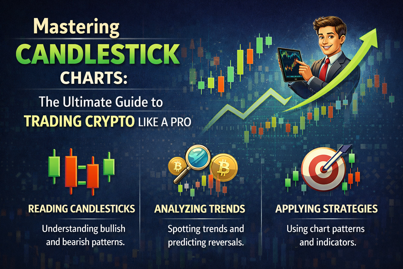
Mastering Candlestick Charts: The Ultimate Guide to Trading Crypto Like a Pro
2026/03/25 14:57:02
In the volatile world of cryptocurrency, timing is everything. Whether you are trading Bitcoin, Ethereum, or the latest altcoin, understanding Candlestick Charts is the non-negotiable first step toward profitability. As a leading crypto exchange, we believe that empowering our users with deep technical knowledge is the key to a sustainable trading ecosystem.
This comprehensive guide will walk you through the origins, mechanics, and advanced strategies of Candlestick Charts, helping you decode market sentiment and anticipate price action with surgical precision.
Key Takeaways
-
Definition: Candlestick Charts are a visual representation of price action, displaying the open, high, low, and close (OHLC) for a specific timeframe.
-
Origin: Invented by Japanese rice traders in the 1700s, Candlestick Charts were designed to track market emotion as much as supply and demand.
-
Market Sentiment: Green candles represent bullish momentum, while red candles indicate bearish control.
-
Predictive Power: Patterns within Candlestick Charts—like the Hammer or Shooting Star—provide signals for potential trend reversals or continuations.
-
Crypto Context: In 24/7 crypto markets, Candlestick Charts are essential for identifying liquidity traps and "whale" movements.
Understanding the Fundamentals of Candlestick Charts
Before diving into complex trading strategies, every crypto trader must master the basic anatomy of Candlestick Charts. Unlike simple line charts that only show closing prices, a candlestick provides a "four-dimensional" view of a specific period.
The Anatomy and Structure of Candlestick Charts
Every single candle on a Candlestick Chart consists of two primary components: the Body and the Wicks (Shadows).
-
The Real Body: This represents the range between the opening and closing price. If the body is filled or green, the asset closed higher than it opened (Bullish). If it is red, it closed lower (Bearish).
-
Upper and Lower Wicks: These thin lines extend above and below the body. They represent the highest and lowest prices touched during that specific timeframe.
-
The Color Logic: In modern crypto trading interfaces, Green/White signifies price growth, while Red/Black signifies a decline.
| Component | Bullish Candle (Green) | Bearish Candle (Red) |
| Top of Wick | Highest Price | Highest Price |
| Top of Body | Closing Price | Opening Price |
| Bottom of Body | Opening Price | Closing Price |
| Bottom of Wick | Lowest Price | Lowest Price |
The Timeframes Used in Crypto Candlestick Charts
One of the most powerful features of Candlestick Charts is their adaptability across different time intervals. Depending on your trading style, you will view these charts differently:
-
Scalpers: Use 1-minute to 5-minute Candlestick Charts for rapid, high-frequency trades.
-
Day Traders: Focus on 15-minute, 1-hour, and 4-hour charts to capture intraday swings.
-
Swing Traders/Investors: Analyze Daily (D), Weekly (W), and Monthly (M) Candlestick Charts to identify long-term market cycles.
The Historical Evolution of Candlestick Charts
To truly appreciate the efficacy of Candlestick Charts, we must look back at their 300-year history. Understanding where they came from helps traders realize that while technology changes, human psychology remains constant.
From Rice Markets to Global Candlestick Charts
The story begins in 18th-century Japan. A legendary trader named Munehisa Homma realized that the rice market was influenced by the emotions of traders. He developed a system to visually represent these emotions, which eventually evolved into the modern Candlestick Charts we see today.
Homma’s success was so legendary that he was said to have made 100 consecutive profitable trades. He understood that the "space" between the open and close price represented the "will" of the market participants.
How Steve Nison Standardized Candlestick Charts for the West
While the Japanese used these charts for centuries, the Western world primarily used "Bar Charts" or "Point and Figure Charts." It wasn't until the early 1990s that Steve Nison introduced "Japanese Candlestick Charting Techniques" to the Wall Street elite.
His work revolutionized technical analysis. Today, it is impossible to find a crypto exchange—from Binance to our own platform—that does not feature Candlestick Charts as the default viewing mode.
Analyzing Key Patterns in Crypto Candlestick Charts
In the crypto industry, volatility is the norm. Candlestick Charts allow traders to spot patterns that signal when a trend is losing steam or when a massive breakout is imminent.
Bullish Reversal Patterns in Candlestick Charts
When the market is in a downtrend, traders look for specific signals in Candlestick Charts to go "Long."
-
The Hammer: A small body at the top with a long lower wick. This suggests that despite heavy selling pressure, buyers stepped in and pushed the price back up.
-
Bullish Engulfing: A large green candle that completely "swallows" the previous small red candle. This indicates a total shift in momentum.
-
Morning Star: A three-candle pattern that signifies the "dawn" of a new bullish trend after a dark period of selling.
Bearish Reversal Patterns in Candlestick Charts
To avoid getting caught in a "rug pull" or a market crash, watch for these signs on your Candlestick Charts:
-
Shooting Star: The opposite of a hammer. A long upper wick indicates that buyers tried to pump the price, but "whales" or sellers dumped the asset, leaving a long trail of rejection.
-
Bearish Engulfing: A massive red candle that overwhelms the previous green candle, signaling that the bulls have run out of gas.
-
Hanging Man: While it looks like a hammer, it appears at the top of an uptrend, signaling that a sell-off is starting.
Indecision Patterns: The Doji
The Doji is perhaps the most famous symbol in Candlestick Charts. It occurs when the opening and closing prices are almost identical. In the crypto world, a Doji often appears before a major news event (like an SEC ruling or a Bitcoin Halving), representing a standoff between bulls and bears.
The Impact of Candlestick Charts on Modern Crypto Finance
The transition to digital assets has not made Candlestick Charts obsolete; it has made them more relevant than ever.
Integrating Candlestick Charts with Algorithmic Trading
Today, the majority of crypto trading volume is driven by bots. These algorithms are programmed to recognize specific patterns in Candlestick Charts. For example, a bot might be set to buy automatically when a "Three White Soldiers" pattern appears on the 4-hour Bitcoin chart. This creates a self-fulfilling prophecy where technical analysis drives actual market liquidity.
Using Candlestick Charts to Detect Crypto Market Manipulation
Crypto markets are often criticized for "wash trading" or "pump and dump" schemes. However, Candlestick Charts provide the transparency needed to spot these moves.
-
Outsized Wicks: Often indicate a "long squeeze" or "short squeeze" where big players trigger stop-losses.
-
Volume Spikes: When paired with Candlestick Charts, volume confirms if a move is genuine or a "fakeout."
Summary: Why Candlestick Charts are Your Best Trading Ally
In conclusion, Candlestick Charts are more than just a way to track prices—they are a window into the soul of the market. By mastering the OHLC structure, historical context, and pattern recognition, you move from "gambling" on crypto to "trading" crypto.
As a crypto exchange dedicated to your success, we recommend starting with high-timeframe Candlestick Charts to understand the macro trend before zooming in for precision entries. Remember: the chart tells the story; your job is simply to read it.
FAQs
Why are Candlestick Charts better than line charts for crypto?
Line charts only show the closing price, hiding the "drama" of the day. Candlestick Charts show you exactly how high and low the price went, revealing if the market was stable or highly volatile, which is crucial for setting stop-losses in crypto.
Do Candlestick Charts work for all cryptocurrencies?
Yes. Whether it’s a high-cap coin like BTC or a low-cap meme coin, the psychology of buyers and sellers remains the same. However, Candlestick Charts are generally more reliable on high-volume assets where manipulation is harder.
What is the most reliable timeframe for Candlestick Charts?
For most traders, the Daily (1D) and 4-Hour (4H) charts provide the best balance between accuracy and noise reduction. Short-term charts (1m, 5m) can often show "fake" signals due to minor price fluctuations.
Can I rely solely on Candlestick Charts to trade?
While powerful, Candlestick Charts should be used with other indicators like Volume, RSI (Relative Strength Index), and Moving Averages. This "confluence" increases your probability of a successful trade.
What does a "Long Wick" mean on a crypto Candlestick Chart?
A long wick signifies "price rejection." If there is a long wick on top, it means the price hit a resistance level where sellers were waiting. If the long wick is on the bottom, it means buyers are protecting that price level aggressively.